
Widget
Leena AI virtual assistant can be embedded into an intranet portal, website, or an enterprise's own employee mobile application via an embed code / SDK (JS snippet).
Desktop — The snippet renders a bubble in the bottom-right corner. The icon can be customized by passing a different bubble image URL. When the user clicks it, the web app opens in a fixed-width container. Width and height default to 360 × 600 px and can be overridden. The location of the chat widget can also be customized by passing the ID of the <div> where it should be anchored.
Integration methods
The SDK supports four ways of embedding the assistant on your web property. Pick the one that best fits your UX — the Floating Widget is the default and the recommended choice for most deployments.
| Method | Summary | Best for |
|---|---|---|
| Floating Widget (default) | Chat bubble at the bottom-right of every page; opens an overlay window on click. | Most intranet / portal / website integrations where the assistant should be available on every page. |
| Embedded in Page | Renders inside a <div> you specify on your page, as a sized panel rather than an overlay. | Dedicated "help" or "support" pages where the assistant is the main content. |
| Open in New Tab | Clicking the bubble (or calling open()) routes the user to the full Leena AI web app in a separate browser tab. | Lightweight integrations where you want a link-like experience and the full-screen app. |
| Programmatic | No bubble is shown. The widget is driven entirely from your own JavaScript / buttons. | Custom UX — you already have a "Need help?" button, sidebar action, or command palette that should open the chat. |
How each method maps to configuration
| Method | Key options |
|---|---|
| Floating Widget | Defaults — no options needed beyond clientId and version |
| Embedded in Page | containerDivID: '<div-id>', typically with displayBubble: false |
| Open in New Tab | openInTab: true |
| Programmatic | displayBubble: false, then call chatteron.open() from your code |
Rendering-mode resolution rules
The widget applies these rules in order to decide how to render:
| Condition | Rendering mode |
|---|---|
openInTab: true | Opens the web app in a new browser tab. |
| Mobile device (default) | Opens in a new browser tab. |
Mobile device + allowOnMobile: true | Renders inline at 90% × 90% of the viewport. |
containerDivID is set | Injects the iframe into the specified host-page element. |
| Desktop, no container | Floating bubble + modal overlay (default). |
Quick start
Desktop — The snippet renders a bubble in the bottom-right corner. The icon can be customized by passing a different bubble image URL. When the user clicks it, the web app opens in a fixed-width container. Width and height default to 360 × 600 px and can be overridden. The location of the chat widget can also be customized by passing the ID of the <div> where it should be anchored.
A sample format of the final code snippet after all customizations:
<html>
<body bgcolor="#FFFFFF">
<div class="parent">
<div id="chat" class="child">
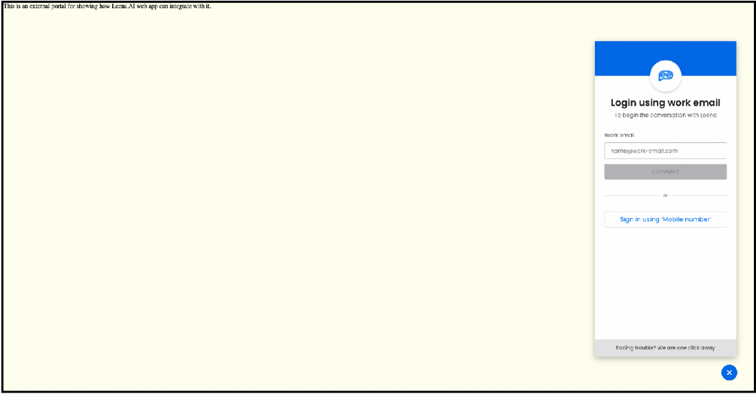
This is an external portal for showing how the Leena AI web app can
integrate with it.
</div>
</div>
</body>
<script defer>
function loadChatWidget() {
chatteron.init({
clientId: 'xxxx-yyyy',
version: 'v2',
bubbleUrl: '<logo link>',
displayBubble: true,
width: 480,
height: 900,
containerDivID: 'chat',
autoPopUp: true,
authToken: '<authToken>',
jwtToken: '<JWT-Token>',
});
}
</script>
<script
defer
src="https://web.leena.ai/scripts/sdk.js"
onload="loadChatWidget();"
></script>
<style>
html, body { height: 100%; }
.parent {
height: 100%;
background: #cccccc;
display: flex;
align-items: center;
justify-content: center;
}
.child {
padding: 24px;
background-color: #80b3ff;
width: 480px;
height: 900px;
}
div#modal-container div#modal-content iframe {
max-height: calc(100vh - 120px) !important;
}
</style>
</html>And this is how it would appear:
Configuration parameters
Core
| Parameter | Default | Description |
|---|---|---|
clientId | — | Tenant identifier provided by Leena AI. Required. |
version | — | SDK API version. Use "v2". |
width | 360 | Width of the chat window, in pixels. |
height | 600 | Height of the chat window, in pixels. |
bubbleUrl | — | URL of the image used for the bubble icon that opens the chat window. |
bubbleWidth | — | Width of the bubble icon, in pixels. |
displayBubble | true | Whether to show the chat bubble. If false, pair with autoPopUp: true so the user can still reach the widget. |
autoPopUp | false | If true, the chat window opens without user interaction. |
allowMaximize | false | Shows a maximize button inside the bubble cluster that expands the modal to full screen. |
containerDivID | — | ID of the <div> where the chat window should be anchored. Used to customize the location. |
authToken | — | Auth token identifying the user. |
jwtToken | — | Optional, but recommended — used to validate the source of access. |
Theme
Prefer these options over CSS overrides wherever they cover your use case.
| Parameter | Description |
|---|---|
themeColor | Primary accent color — applied to the close/maximize button backgrounds and other action surfaces. |
theme.bubble.width / theme.bubble.height | Bubble dimensions. Equivalent to bubbleWidth for width. |
theme.bubble.bottom / theme.bubble.right | Bubble offset from the viewport edges. |
theme.header.height | Height of the modal header strip. |
theme.header.color | Modal header background color. |
theme.fontSize.chat | Font size for chat messages. |
theme.fontSize.input | Font size for the input field. |
theme.fontSize.menu | Font size for menu items. |
Help bubble
| Parameter | Description |
|---|---|
showHelp | If true, shows a help callout above the bubble prompting the user to engage. |
helpConfig.title | Title text for the help callout. |
helpConfig.subtitle | Subtitle text for the help callout. |
Header buttons
| Parameter | Description |
|---|---|
headerButtons | Adds buttons into the modal header. When in use, the default bottom cluster of bubble buttons is hidden via the .Leena-hide-footer-btn class. |
Programmatic control
Once the SDK is loaded, window.chatteron exposes the following methods:
| Method | Description |
|---|---|
chatteron.init(options) | Initializes the widget and pre-loads the iframe in the background so the first open is instant. |
chatteron.lazyInit(options) | Same as init, but skips the background iframe pre-load — the iframe is only created when the user first opens the widget. Use this to minimize initial page-load impact on performance-sensitive pages. |
chatteron.open(data?) | Opens the chat window. An optional data payload is forwarded to the web app (useful for passing user context such as the current page, user ID, or a pre-filled query). |
chatteron.close() | Closes the chat window. |
Hide the bubble and drive the widget from your own UI
chatteron.init({
  clientId: 'xxxx-yyyy',
  version: 'v2',
  displayBubble: false, // no floating bubble
  authToken: '<token>',
  jwtToken: '<jwt>'
});

document.querySelector('#help-link').addEventListener('click', () => {
  chatteron.open({ userId: 'u_123', context: 'support' });
});

document.querySelector('#close-chat').addEventListener('click', () => {
  chatteron.close();
});
Defer loading the iframe until the user asks for it
chatteron.lazyInit({
  clientId: 'xxxx-yyyy',
  version: 'v2'
});
With lazyInit, the bubble is still rendered on page load but no iframe is created until the user clicks it. This saves bandwidth and CPU for visitors who never open the widget.
Mobile behaviour
By default, mobile devices (iOS, Android, BlackBerry, Opera Mini, IE Mobile) open the chat in a new browser tab. This is usually what you want on mobile — the viewport is too small for a useful inline modal, and the full-page experience has better keyboard handling.
If you want the widget to render inline on mobile anyway:
chatteron.init({
  clientId: 'xxxx-yyyy',
  allowOnMobile: true
});
With allowOnMobile: true, the chat window takes up 90% × 90% of the viewport on mobile.
To always open in a new tab regardless of device:
chatteron.init({
  clientId: 'xxxx-yyyy',
  openInTab: true
});
Embedding in a mobile app: A similar snippet can be used to embed the assistant inside a native mobile application's WebView, with limited customization options on size. Reach out to your Leena AI contact for the recommended WebView configuration.
Common integration patterns
1. Default floating bubble on every page
Include the SDK script on your common layout / master template:
<script defer src="https://web.leena.ai/scripts/sdk.js"
        onload="chatteron.init({ clientId: 'xxxx-yyyy', version: 'v2' });">
</script>
2. Embed inline in a specific page container
<div id="leena-embed" style="width: 400px; height: 640px;"></div>

<script defer>
  function loadChatWidget() {
    chatteron.init({
      clientId: 'xxxx-yyyy',
      version: 'v2',
      containerDivID: 'leena-embed',
      displayBubble: false,
      width: 400,
      height: 640
    });
  }
</script>
<script defer src="https://web.leena.ai/scripts/sdk.js"
        onload="loadChatWidget();"></script>
3. Open the chat from your own "Need help?" link
<a href="#" id="need-help">Need help?</a>

<script defer>
  function loadChatWidget() {
    chatteron.init({
      clientId: 'xxxx-yyyy',
      version: 'v2',
      displayBubble: false,
      authToken: window.APP_STATE.authToken,
      jwtToken: window.APP_STATE.jwtToken
    });

    document.getElementById('need-help').onclick = (e) => {
      e.preventDefault();
      chatteron.open({ source: 'help-link' });
    };
  }
</script>
<script defer src="https://web.leena.ai/scripts/sdk.js"
        onload="loadChatWidget();"></script>
4. Auto-popup the chat after a delay
chatteron.init({
  clientId: 'xxxx-yyyy',
  version: 'v2',
  autoPopUp: true,
  autoPopUpDelay: 4000 // 4 seconds after page load
});
5. Defer loading until the user clicks the bubble
chatteron.lazyInit({
  clientId: 'xxxx-yyyy',
  version: 'v2'
});
6. Customize the bubble position away from the default bottom-right
chatteron.init({
  clientId: 'xxxx-yyyy',
  theme: {
    bubble: { bottom: 32, right: 48 }
  }
});
Frequently asked questions
Q. Can I change the bubble icon?
Yes — set bubbleUrl to the absolute URL of the image you want to use. For best results, use a square PNG of at least 128 × 128 px.
Q. Can I change the bubble's position or shape?
Position and size are available through theme.bubble.{width, height, bottom, right}. For anything beyond that (rounded-square shape, custom hover state, etc.), reach out to the Leena AI team.
Q. Can I show a notification badge on the bubble?
Yes — the widget exposes a notification counter that your backend or the web app itself can drive. Talk to your Leena AI contact to enable the relevant events.
Q. Does the widget work in iframes / inside another web app?
Yes. If the host page is itself embedded, include the SDK script in the host's own document — the widget will render in the outermost iframe that runs the snippet.
Q. What happens on very small viewports?
By default, mobile devices open the chat in a new tab. If allowOnMobile: true is set, the widget sizes to 90% of the mobile viewport.
Q. How do I make the widget persist a user across pages?
As long as you pass the same authToken / jwtToken on every page, the widget's session is tied to the authenticated user, not the page.
Need more customization?
The options documented above cover the customization paths that are officially supported through the SDK. If your requirements go beyond what's exposed here — bespoke bubble shapes, redesigned notification badges, custom hover / open / close animations, or deeper visual integration with your design system — please reach out to the Leena AI team.