
Performance Metrics
This dashboard provides a high-level overview of key metrics related to candidate onboarding statuses, allowing users to track overall progress and performance at a glance.
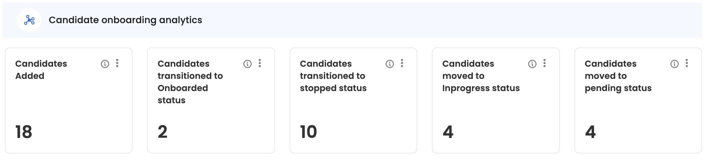
Activities within the period
The top view cards provide a numerical indicator of the overall activity by onboarding dashboard users in the selected time range, such as candidate addition, candidates transitioned to onboarded/stopped status etc.
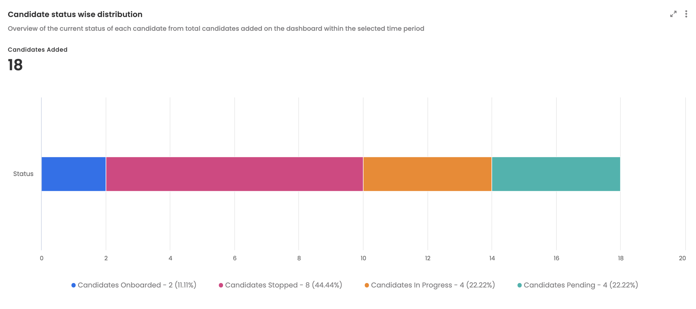
Candidate status wise distribution
Provides an overview of the current status of each candidate from total candidates added on the dashboard within the selected time period.
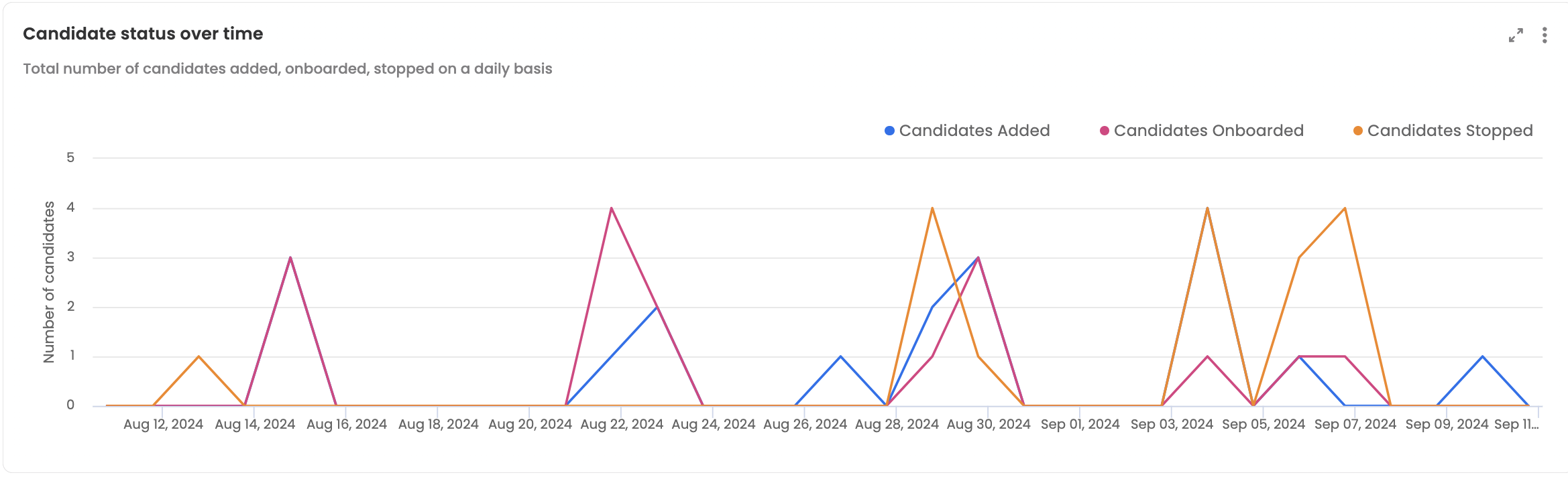
Candidate status over time
Provides a timeline view of the total number of candidates added, onboarded, stopped on a daily basis.
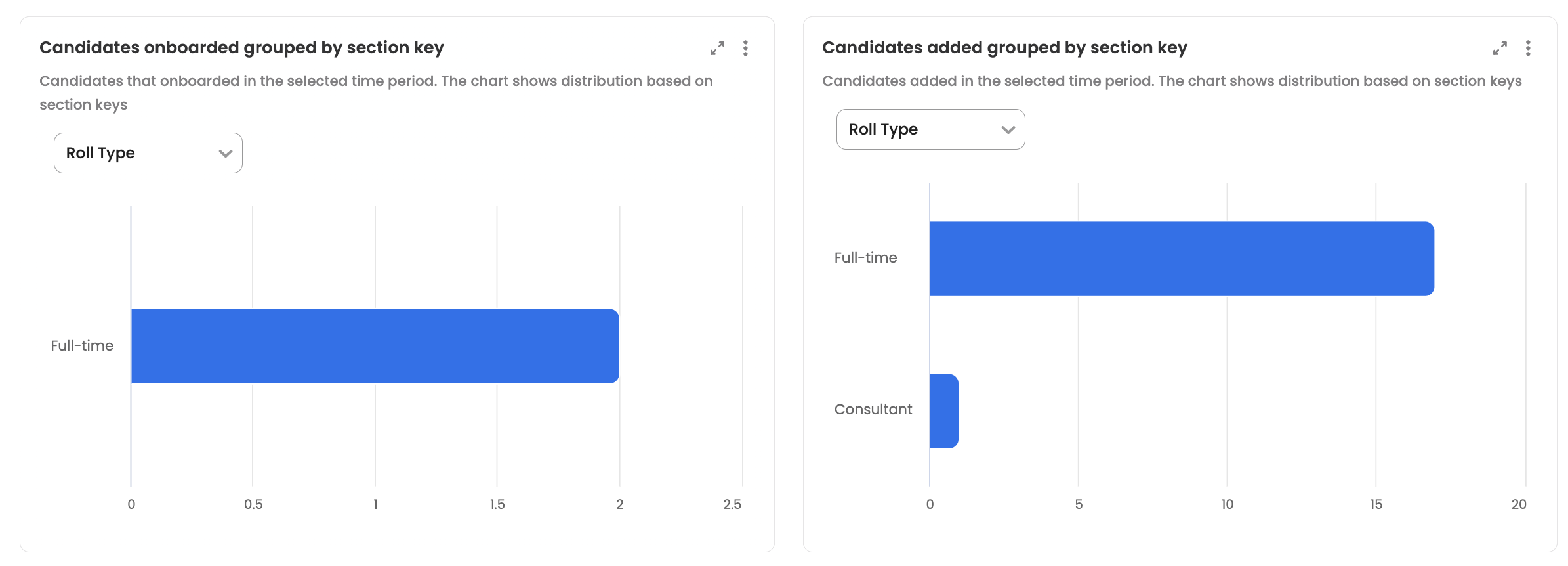
Candidates onboarded/added grouped by section key
Bar chart on the number of candidates that were onboarded/added in the selected time period. The chart shows distribution based on section keys which can be selected via the dropdown.
Candidate onboarding reinitiated
Provides a pie chart that shows the total number of candidate whose onboarding journey was re-initiated along with the option chosen (start fresh/continue from where candidate left) for re-initiation.
Only the candidates that have their re-initiated date within the selected time range would be displayed here.

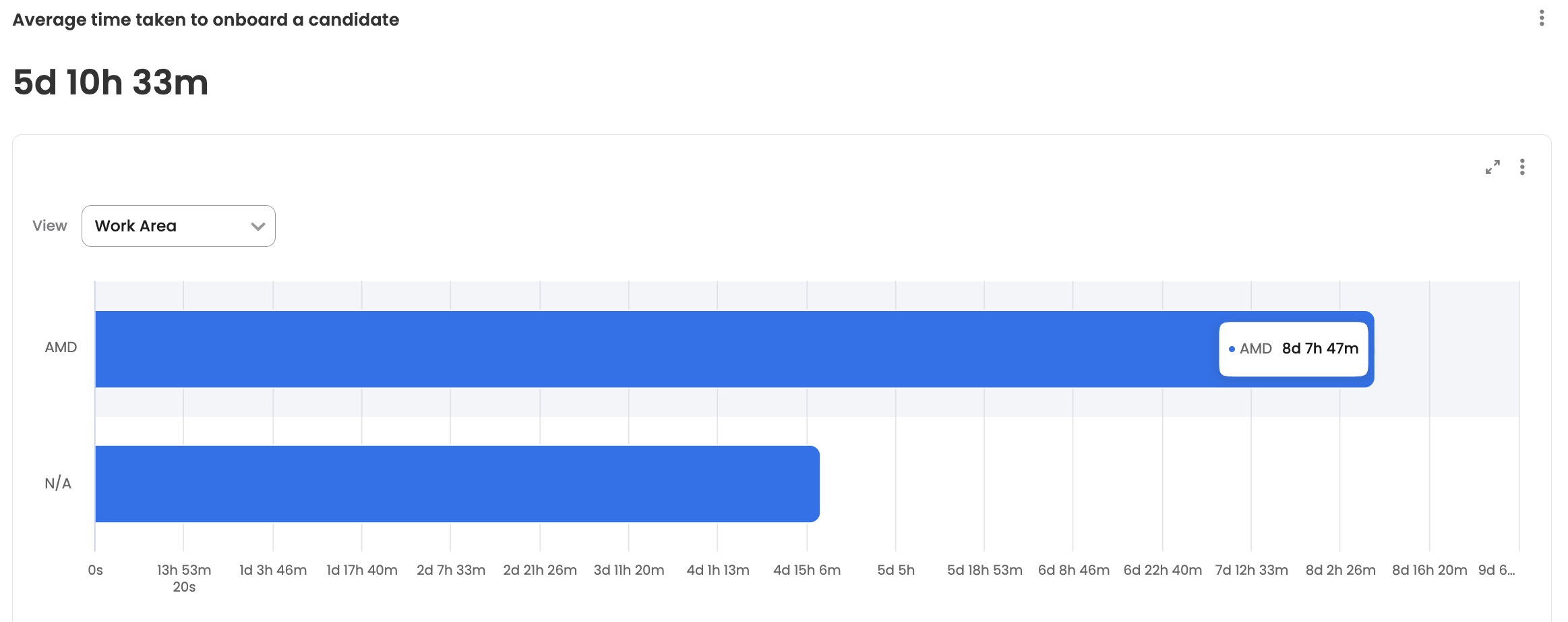
Average time taken to onboard a candidate
Presents the overall average time taken to onboard a candidate.
Only the candidates that have their onboarded date within the selected time range would be displayed here.
Time taken to onboard a candidate is calculated as "Timestamp of when the candidate's status was marked as 'Onboared'" - "Timestamp of when the candidate was added onto the Leena AI's onboarding dashboard, either via manual addition or API integration". Additionally, users can group the metrics on any of the section keys defined in the onboarding dashboard via the dropdown provided.
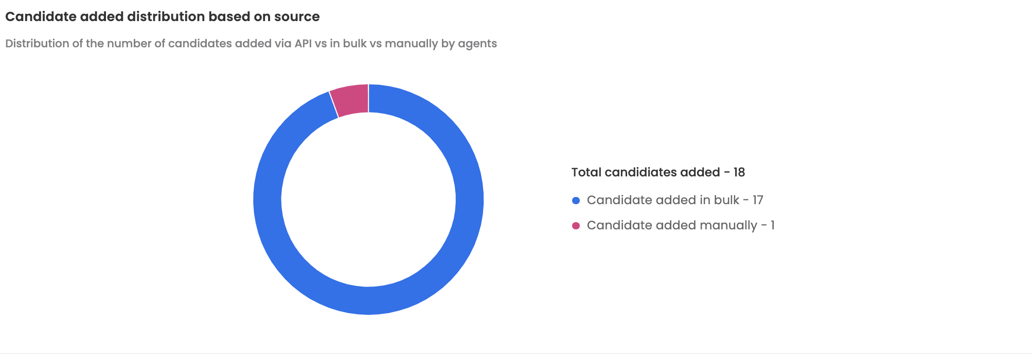
Candidate added distribution based on source
Presents a pie chart which displays the distribution of the number of candidates added via API vs in bulk vs manually by agents within the selected time period.
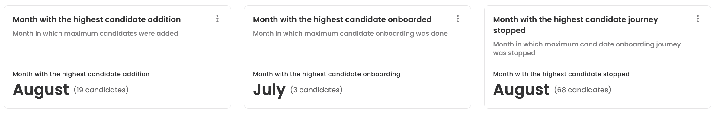
Month aggregated metrics
These cards provide the information related to the month which had the highest candidate addition/onboarding/journey stopped.
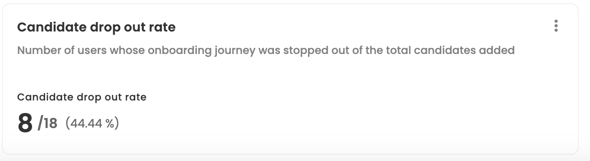
Candidate drop out rate
Provides information on the number of users whose onboarding journey was stopped out of the total candidates added within the selected time period. This metric helps users understand if their attrition rate regarding to the onboarding/offboarding journey.
Number of users whose DOJ/LWD was changed
Provides information on the number of users whose Date of Joining (DOJ) or Last Working Day (LWD) was changed within the selected time period. This metric helps users understand if their onboarding/offboarding journey has significant delays.