Form Components & Supported fields
Components
A form structure is divided into 2 segments:
- Form components: These components generally are used to enhance the visual appeal of the entire form & share additional information.
- Field components: These components capture inputs/information from the user in the defined format such as Date, Input text etc.
Field & Form components
-
Header: It allows user to add information on the form.
-
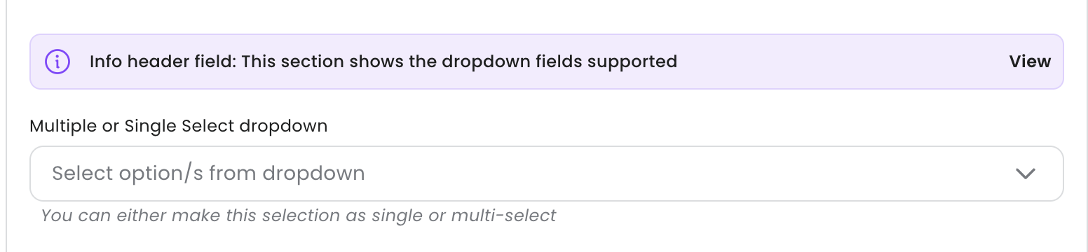
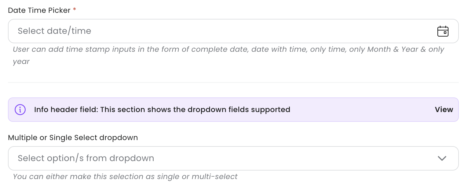
Info-header: The user can add information on the form for the end-user. It allows users to add info-header title, a URL & help-text.
-
Divider: The user can add a divider/horizontal line on the form. This allows user to slit form into sections.
-
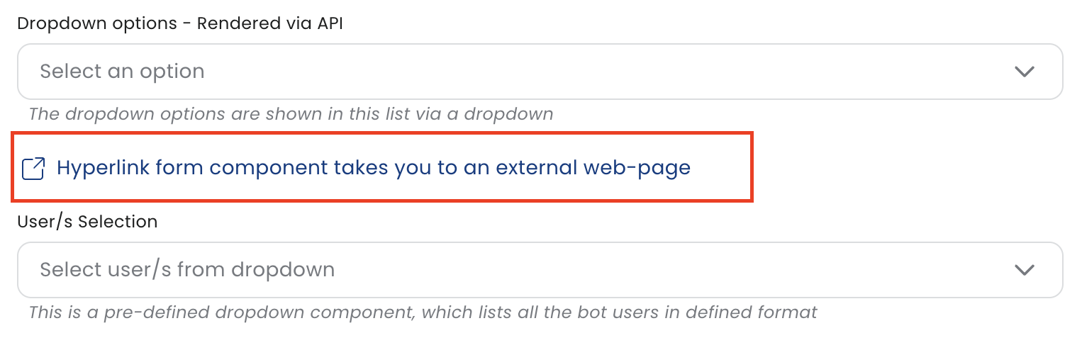
Hyper-link: The user can add a information component within the form.
-
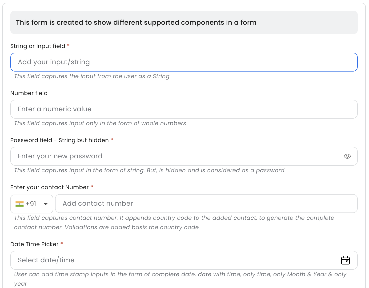
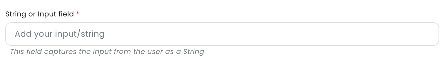
Text: This is an input component, which allows user to add details/input as a string.
-
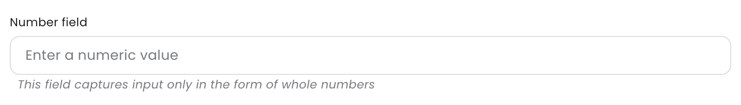
Numeric: This is an input component, which allows user to add details/input as Numeric.
-
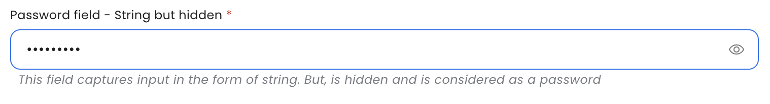
Password: This is an input component, which allows user to add details/input that is hidden and it considered as a password.
-
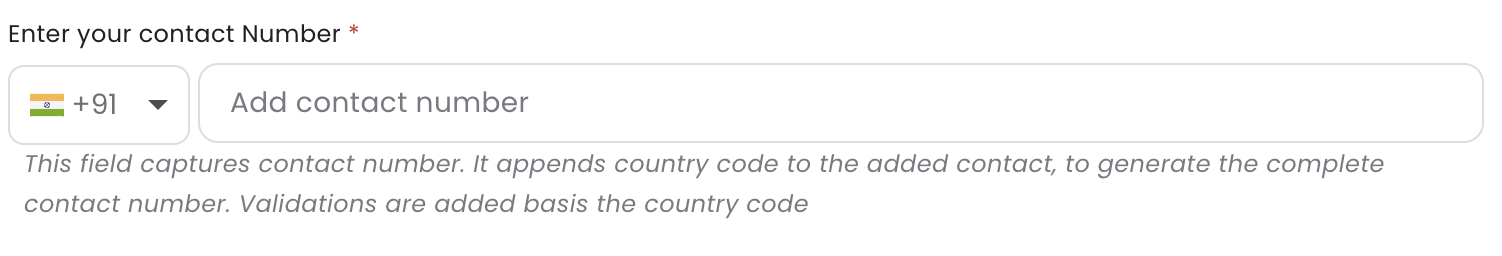
Phone Number: This is an input component, which allows user to add input as phone number.
-
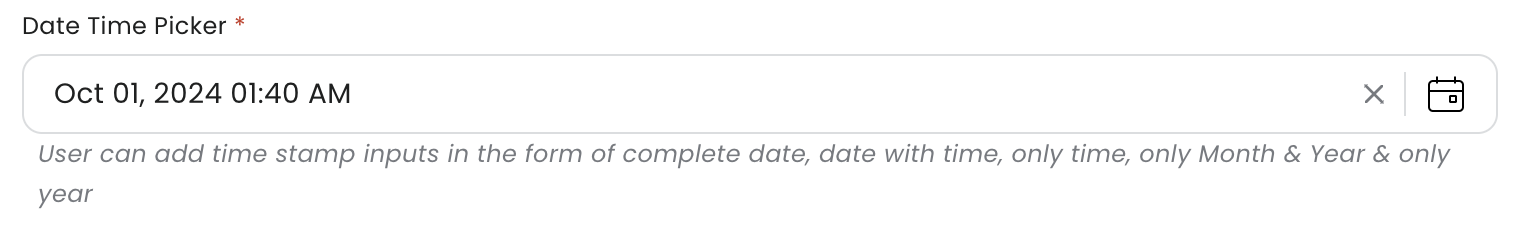
Date: This is an input component, which allows user to add input as Date. The supported formats are: Only date, Date & time, Only date, Only Month & Year, Only Year.
-
Date comparison: This component gets auto-populated. It adds a calculation (subtraction/addition) of 2 dates. This field reflects once the input for 2 dates are added by the user.

-
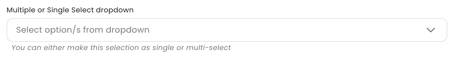
Dropdown: This component renders options in the dropdown. The user can define value & label for each option. This selection can be single or multiple, and is controlled via a configuration.
-
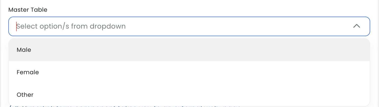
Master Table: This component renders options from a table/list which can be created separately. This separately maintained table/list is called the 'Master Table'. The selection in this dropdown can be configured as single or multiple select.
-
Dynamic Dropdown: API end-point can be configured to render dropdown options dynamically by calling this API.
-
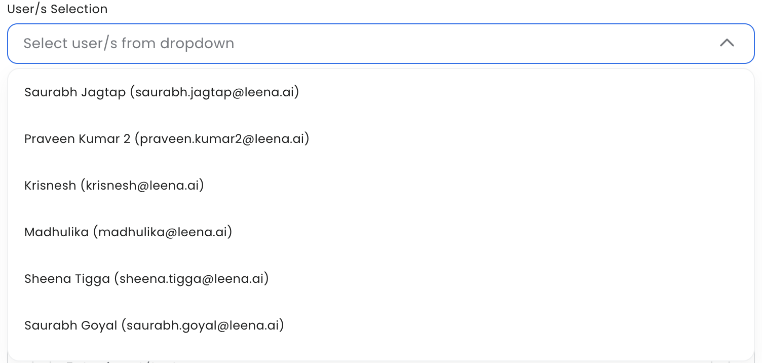
User component: This is a pre-defined dropdown, which renders the option/s as bot users. The render options can be rendered as either Full Name, Full Name (Email) or Full Name (E-code).
-
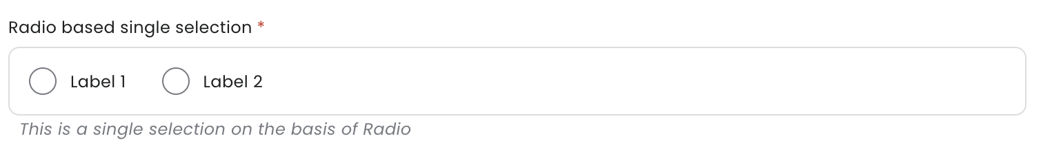
Radio: The options render as radio selection. The end-user can only select a single option. The options can be configured as Label & Value. Only Labels are shown to the end-user.
-
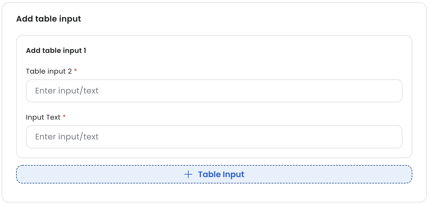
Field Array: This is a table component, which holds multiple fields. For example, Education Details. The table component/Field Array renders on the form for the end-user with option to add more list/array items.
-
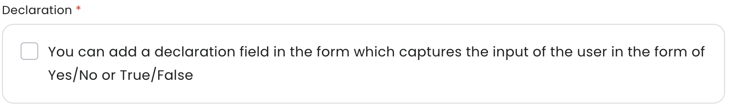
Declaration: Admin can add a declaration component, which can capture Yes/No or True/False input from the end-user.
-
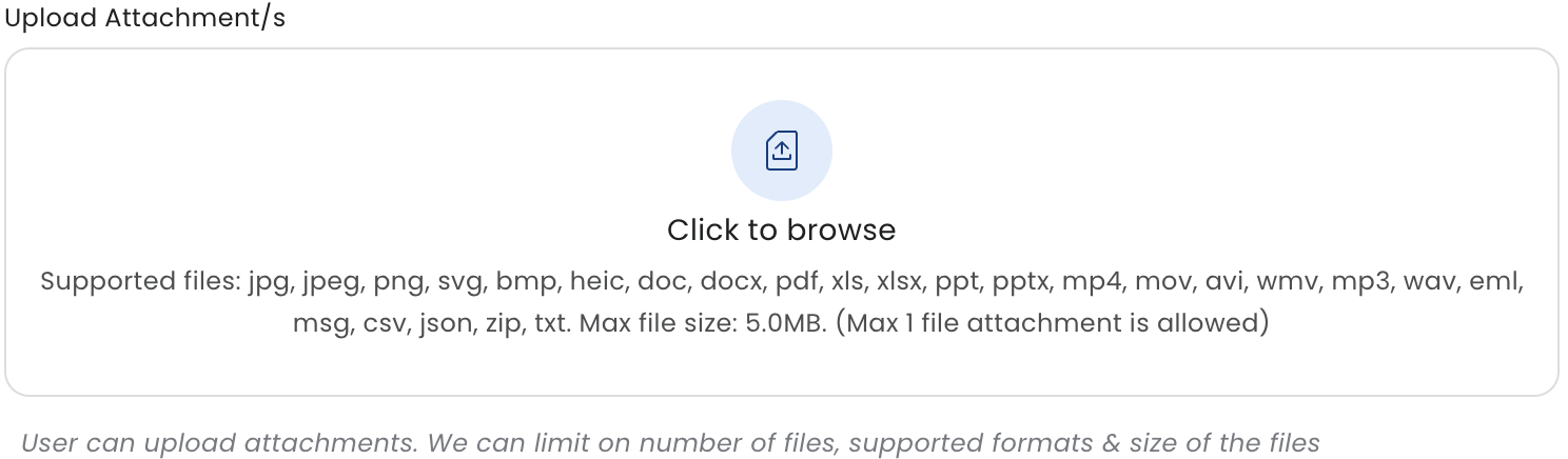
Attachment: This component allows end-user to upload attachments on the form. The admin can control what can be the maximum number of files, size of files and type of files which can be permitted.