
Settings
The Virtual assistant page controls how the Leena AI web app looks and behaves for employees — its name and theme, the actions pinned to the left sidebar, and what people can see and do inside a conversation.
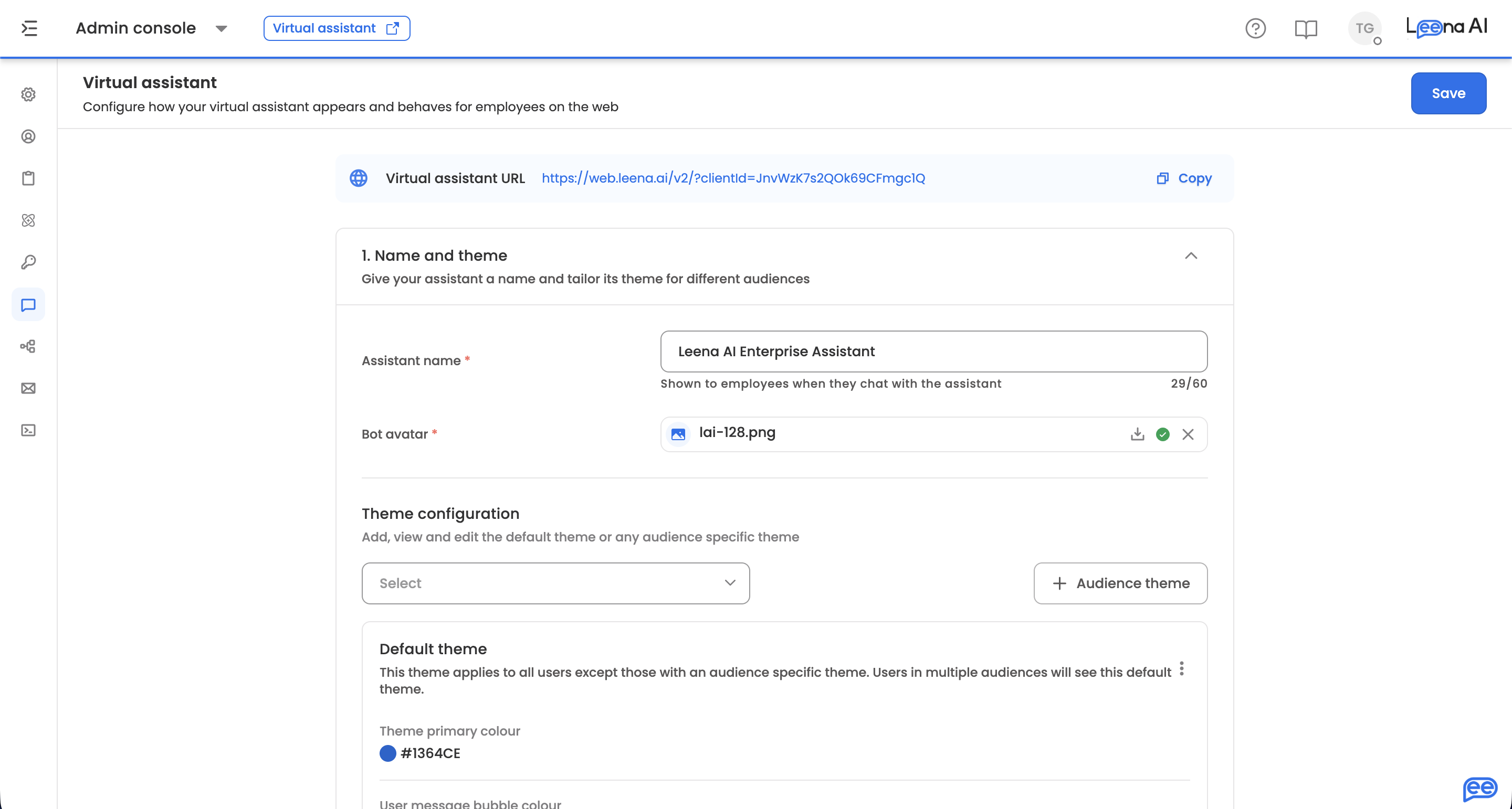
Where to find it
Open the Admin Console, then go to Leena Channels → Settings.
The embeddable chat widget is configured separately, under Leena Channels → Widget config.
The Virtual assistant URL is shown at the top of the page, with a copy action. This is the address employees use to reach the assistant on its own page, separate from any embedded widget.
The page works through three numbered sections, from naming to in-chat behaviour.
A couple of settings depend on your assistant versionOnboarding sliders and thumbnail previews apply only to assistants on version 2. If either isn't on your screen, your workspace is on an earlier version — check with your Leena AI contact before planning around it.
1. Name and theme
Give your assistant a name and tailor its theme for different audiences.
| Setting | What it does |
|---|---|
| Assistant name | Shown to employees when they chat. Mandatory, up to 60 characters |
| Bot avatar | The assistant's avatar. Accepts one PNG, JPG or JPEG |
| Theme configuration | Opens the theme editor — see below |
Theme configuration
The editor manages the default theme plus any number of audience themes, so different populations can see different branding.
The default theme applies to everyone without an audience theme, and to anyone who falls into more than one audience. It can't be deleted; deleting an audience theme leaves it untouched.
Each theme carries:
| Setting | What it does |
|---|---|
| Theme primary colour | The main brand colour, and the basis for other derived colours. Required |
| User message bubble colour | The background of the employee's own messages. A primary colour must be set first — the editor blocks this until one exists |
| Chat window background | Generated automatically from the primary colour. Click Customise to override with either a solid Colour or an uploaded Image |
Closing the editor with unsaved changes asks you to confirm before discarding them.
2. Sidebar actions
Pin webviews, quick replies and external links to the assistant's left panel. Every entry can be restricted to an Audience, defaulting to Everyone — so the panel adapts to who's looking at it.
Webviews and quick replies
Pin pages from your tools, and quick replies that start common requests. Add offers three kinds of entry:
| Type | What it is |
|---|---|
| Folder | A group name in the sidebar, holding up to 5 items |
| Webview | Embedded forms for employees to fill |
| Quick reply | Pre-set prompts for employees |
A webview takes:
| Field | Notes |
|---|---|
| Webview | The category. Pick one of your configured webviews, or Custom webview to point anywhere |
| Webview title | Mandatory |
| URL | Validated as a URL |
| Audience | Defaults to Everyone |
| Icon | Chosen from the icon list |
A quick reply triggers a capability rather than opening a page. It takes a Quick reply title, a Module ID identifying what it triggers, and an audience.
A folder takes a Folder name and Folder icon, then holds webviews and quick replies — up to five. Entries can be reordered by dragging, inside a folder or at the top level.
External Links
Links out to sites outside the assistant — an intranet, a knowledge base, an HR portal. Each takes an External link title, a URL, and an audience. Title and URL are mandatory, and the URL is validated.
3. Display and interactions
Choose what employees can see and do in chat.
| Setting | What it does |
|---|---|
| Chat history deletion | Employees can delete their own chats |
| Enable multi-chat | Employees can run several chats at once |
| Enable webapp V3 | Employees see the redesigned web app. Needs multi-chat on |
| Enable onboarding sliders | Shows an onboarding tour on an employee's first visit. Version 2 only |
With sliders on, configure them below: each slide takes a Slider title of up to 60 characters, a Media type of Image or Video, and an uploaded file up to 3 MB — PNG, JPG or JPEG for images, MP4 or MOV for video. Slides can be reordered by dragging.
Enable file upload
Lets employees attach files to a message.
| Setting | What it does |
|---|---|
| Max file upload size | The largest single attachment, in MB. Defaults to 5. Leave it unless a larger limit has been agreed — the server enforces its own ceiling |
| Max files per user message | How many files can go on one message. Defaults to 25 |
Show disclaimer banner
Displays a persistent banner at the top of the chat for every user when the assistant loads.
| Setting | What it does |
|---|---|
| Disclaimer message | The text shown to every user. Up to 500 characters |
| Show dismiss button | Lets employees close the banner |
| Dismiss button text | The button label. Defaults to "Dismiss" |
| Dismiss behaviour | Once keeps it dismissed; Always brings it back on every load. The preference is per device |
Additional settings
| Setting | What it does |
|---|---|
| Allow employees to copy responses | Adds a copy action to the assistant's messages |
| Restrict employees from downloading attachments | Blocks downloads of images, videos and files together |
| Show thumbnail previews in chat | With it off, no thumbnails are generated and only the file type is shown. Version 2 only |
| Hide logout option | Removes logout from the assistant's settings menu. Logout is always hidden inside Outlook, Microsoft Teams and Kiosk, and only appears when an authentication type is configured |
| Restrict screenshots in mobile app | Blocks screenshots, screen recording and the app-switcher preview for this assistant in the mobile app |
| Auto-delete old chats | Deletes conversations past an age you set — Delete chats older than a number of days, months or years |
| Allow employees to change their profile picture | Lets employees set their own avatar |
| Offer a preset avatar library | Gives employees a set of avatars to choose from. Upload them as JPEG, JPG or PNG |
Enable employee satisfaction (ESAT) surveys
Asks employees to rate their experience. Turning it on reveals four thresholds:
| Setting | What it controls |
|---|---|
| Sessions before first survey | Sessions before an employee is asked the first time |
| Days before first survey | Time before an employee is asked the first time |
| Sessions before next survey | Sessions before the same employee is asked again |
| Days before next survey | Time before the same employee is asked again |
Set these generously. Asking too early gives you ratings from people who haven't formed a view, and asking too often trains employees to dismiss the prompt.
Saving
Save sits in the page header and applies the whole page. If something doesn't validate, the page tells you to fix it before saving; a confirmation appears once the configuration updates.
Updated 18 days ago