
Advanced field properties
Beyond a label and a value, most form fields have a set of properties that control how they behave — whether they're required, when they appear, what input they accept, and whether they can be edited.
The exact options available depend on the field type, but the following properties are common across most components.
Where these are configured
These properties live in two places:
- The Form builder (per field). Open your form, then add or click a field to open its settings/configuration panel. This is where you set the field's label, placeholder, help text, default value, mandatory toggle, validation, mask, and conditional visibility. Each field is configured individually.
- Workflow Permissions (per node). Whether a field is Editable, Read only, or Hidden can be set per workflow step under Workflow Permissions — so the same field can be editable at one node and read-only at another. See How to configure permissions.
The sections below describe each property; the heading notes where it's set when it isn't the field's own settings panel.
Mandatory (required)
Mark a field required so the form can't be submitted until it has a value. Optional fields can be left blank.
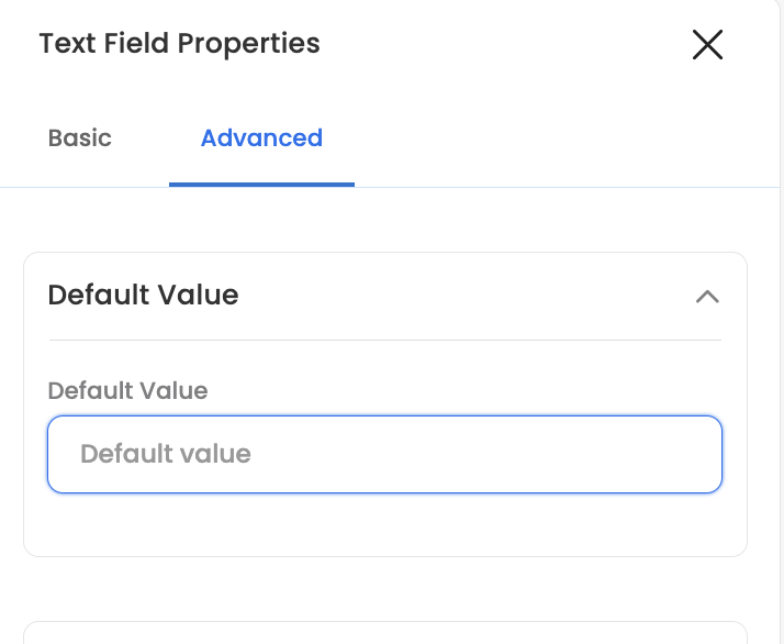
Default value
Give a field a default value that's pre-filled when the form opens. The user can change it (unless the field is read-only). This is useful for the most common answer or a pre-set option.
Help text
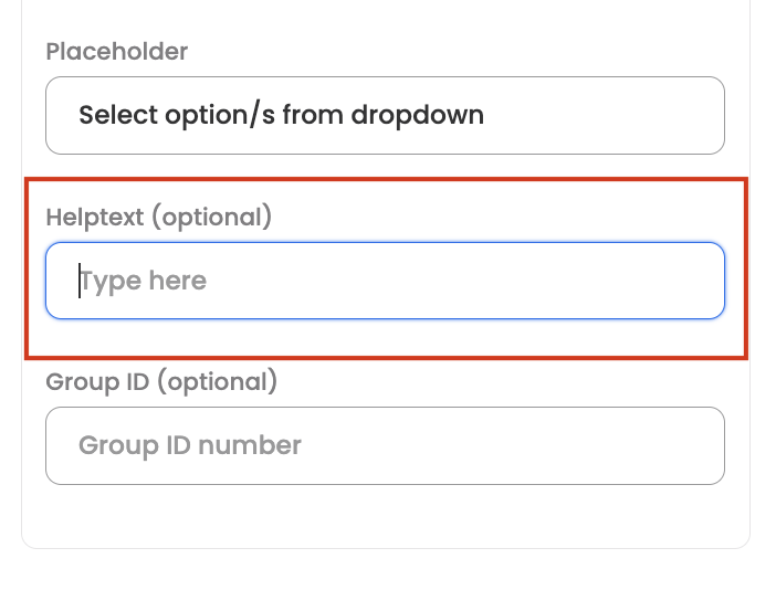
Add help text to explain what the field is for or how to fill it — shown alongside the field to guide the user.
Editable / read-only / hidden (Workflow Permissions)
Whether a field is Editable, Read only, or Hidden is controlled per node under Workflow Permissions — not in the field's own settings. This means the same field can be editable at one step and read-only (or hidden) at another. Use read-only to show a value users can see but can't change, often alongside a default or pre-filled value. See How to configure permissions.
Mask field
Turn on mask field to hide the entered value (shown masked rather than in plain text) — useful for sensitive inputs.
Validation (including regex)
Restrict what a field will accept using validation. Text fields offer preset patterns plus a custom option:
- Alphanumeric — letters and numbers only, no special characters.
- Any value — accepts any characters (no restriction).
- Email — must be a valid email address.
- Regex — supply your own regular expression for full control.
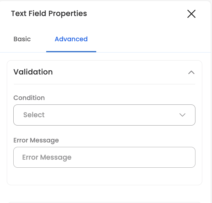
Text inputs can also enforce a maximum length, and offer input controls such as auto-convert to uppercase and disable copy / cut / paste.
Conditional visibility
Show or hide a field based on what's entered elsewhere in the form, so users only see relevant questions. You set a condition on another field's value; when it's met, the field appears.
Conditions support operators such as equals, is any of, is neither of, greater than, and less than, and you can compare one field against another. You can also combine multiple conditions so a field shows only when all of them are satisfied.
For pre-filling and related form logic, see Form Settings › Conditional autofill.