
Table component
The Table component renders line items as a table: one row per line item, with the configured fields as columns. Use it when line items need to be reviewed or actioned per row — for example expense claim lines, asset transfer items or advance claims. For plain repeating input without row-level review, use the Field Array component.
Table vs Field ArrayThe Table component is a separate component with its own configuration — it is not a display mode of Field Array. The choice between Table & Field Array is made when the form is built; a form can't be switched from one to the other later.
How it renders
- Rows & columns: every line item is a row & every configured field is a column, with the field label as the column header. Column headers stay visible while the table scrolls vertically inside a fixed-height area; when the columns are wider than the viewport, the table also scrolls horizontally.
- Expanded row: a row can be expanded in place (View details) to show the fields configured to appear in the expanded row only — useful for secondary details that don't need their own column.
- Row menu: each row has a three-dot menu with View details & Remove (when removing rows is allowed).
- Add row: a button below the table appends a new row; its label is configurable.
- Search: when enabled, a search box above the table filters rows — it only hides non-matching rows, it never removes them.
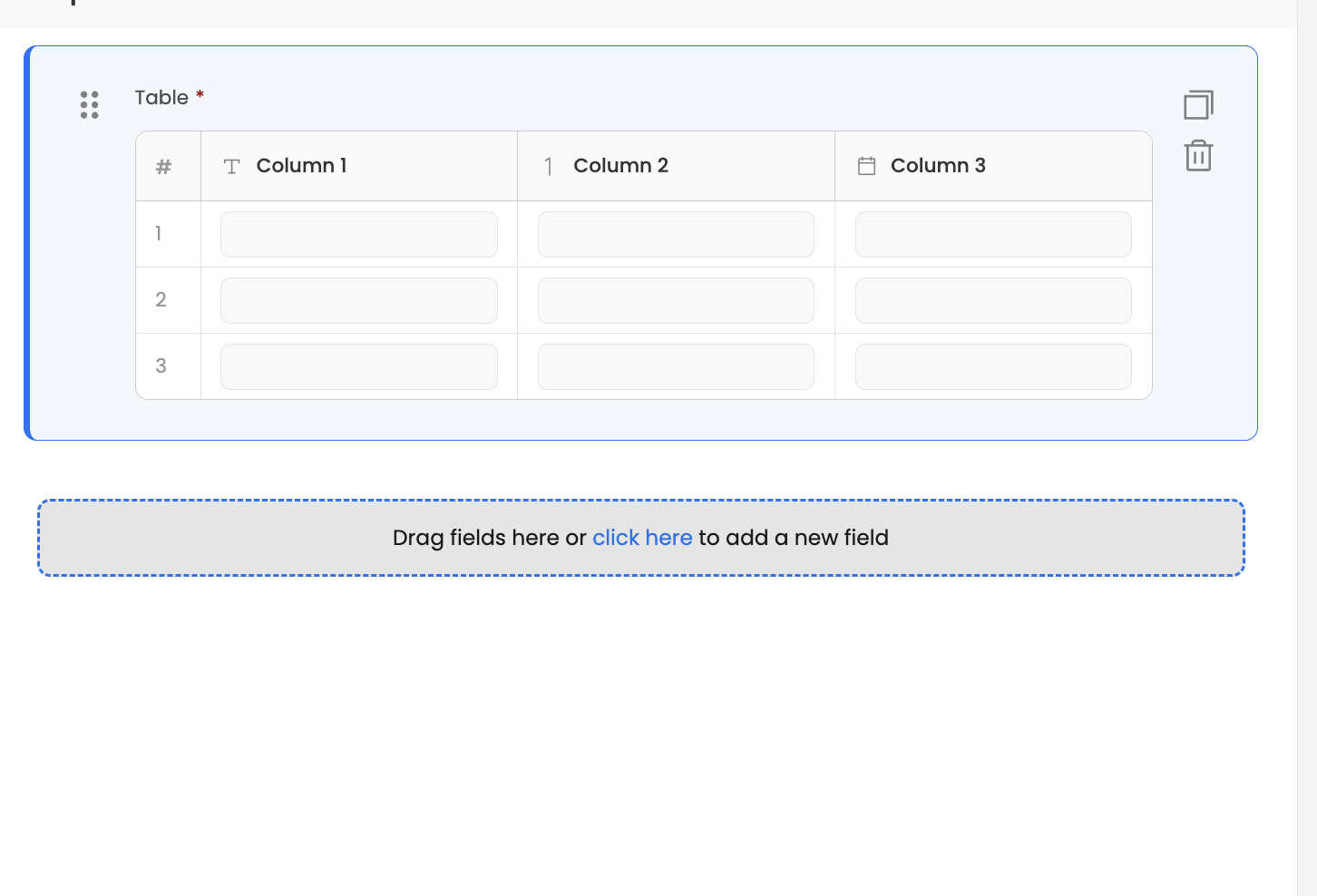
Editing cells
- A cell shows plain text until the end-user clicks it (or double-clicks it, depending on the Edit cell on setting). The open cell renders the column's regular input with its own validations, options & dependencies. Enter or F2 also open the focused cell, Tab moves to the next editable cell & Esc restores the previous value.
- A cell that fails validation is highlighted with an info icon at its end — hovering over the icon shows the error message.
- A read-only column's cells never open. Making the whole table (or the form) read-only disables all editing, along with adding & removing rows.
Configuration — Basic tab
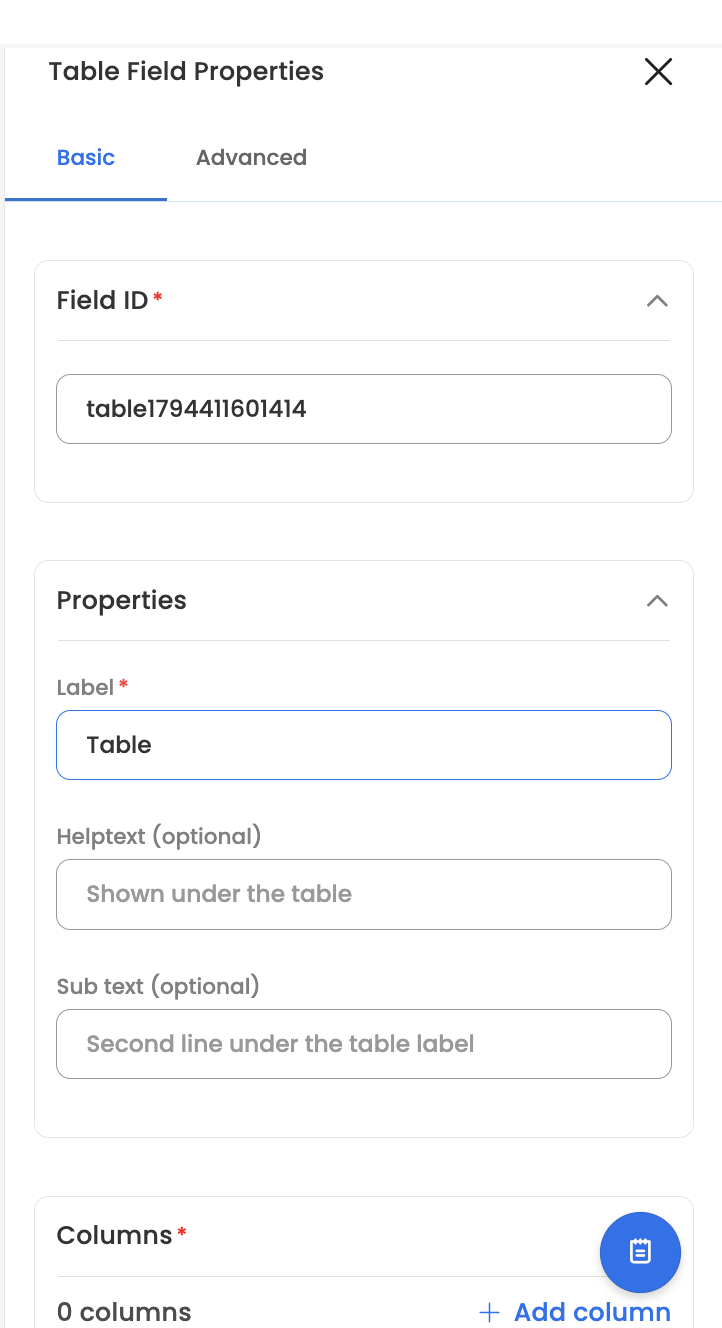
- Field ID: the unique identifier of the table field.
- Properties: Label, Helptext (shown under the table) & Sub text (an optional second line under the table label).
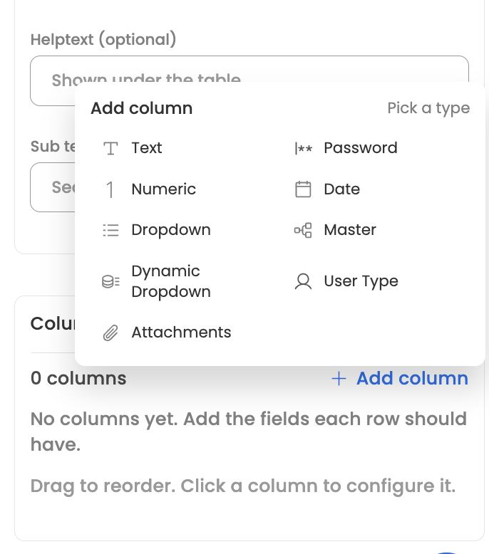
- Columns: the table's fields. Add column opens a type picker, columns can be dragged to reorder & each column's menu offers Duplicate & Delete.
A column can be one of: Text, Numeric, Password, Date, Dropdown, Master, Dynamic Dropdown, User Type & Attachments. Field Array, another Table & layout components such as Header or Divider can't be added inside a table.
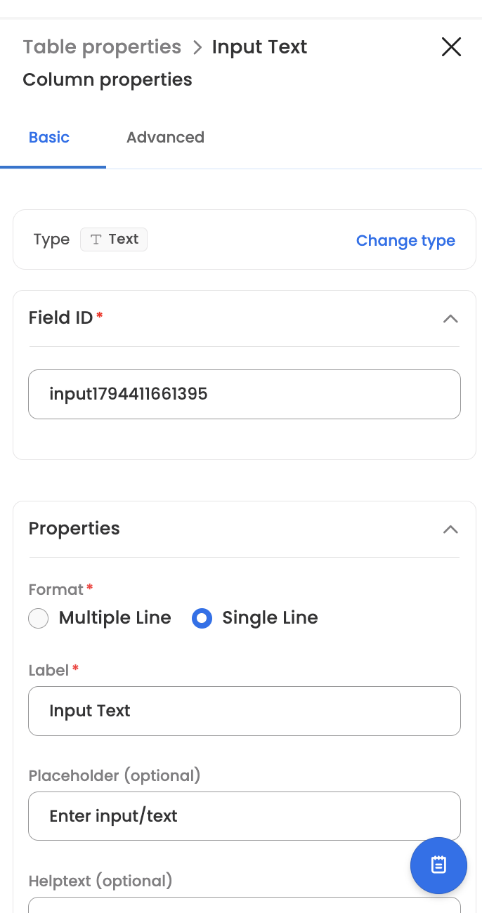
Column properties
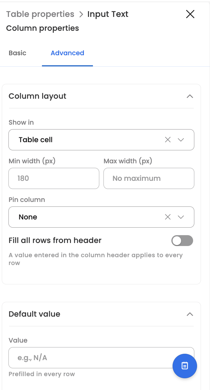
Clicking a column opens its Column properties panel. The Basic tab holds the column's type (changeable via Change type), its Field ID & the standard properties of that field type (label, placeholder, help text & so on). The Advanced tab holds the column layout options below & a Default value that is pre-filled in every row.
Column layout
Each column's Advanced tab includes a Column layout section with table-specific options:
- Show in: Table cell (default) renders the field as a column; Expanded row only moves it to the row's expanded view.
- Min width (px): the column's minimum width — 180 by default.
- Max width (px): an optional cap on the column's width. Longer text truncates with an ellipsis & shows in full on hover. Must be at least the min width.
- Pin column: Left or Right keeps the column visible while the table scrolls horizontally. A pinned column renders at a fixed width (min width, else max width).
- Include in table search: shown when the table's search is on; on by default. Controls whether search matches this column's text.
- Fill all rows from header: renders the column's own field in the column header — a value entered there applies to every row the end-user can edit. Locked or hidden rows are skipped & the header value itself is never submitted. Not available for attachment, rich-text, code & password columns.
Configuration — Advanced tab
Rows
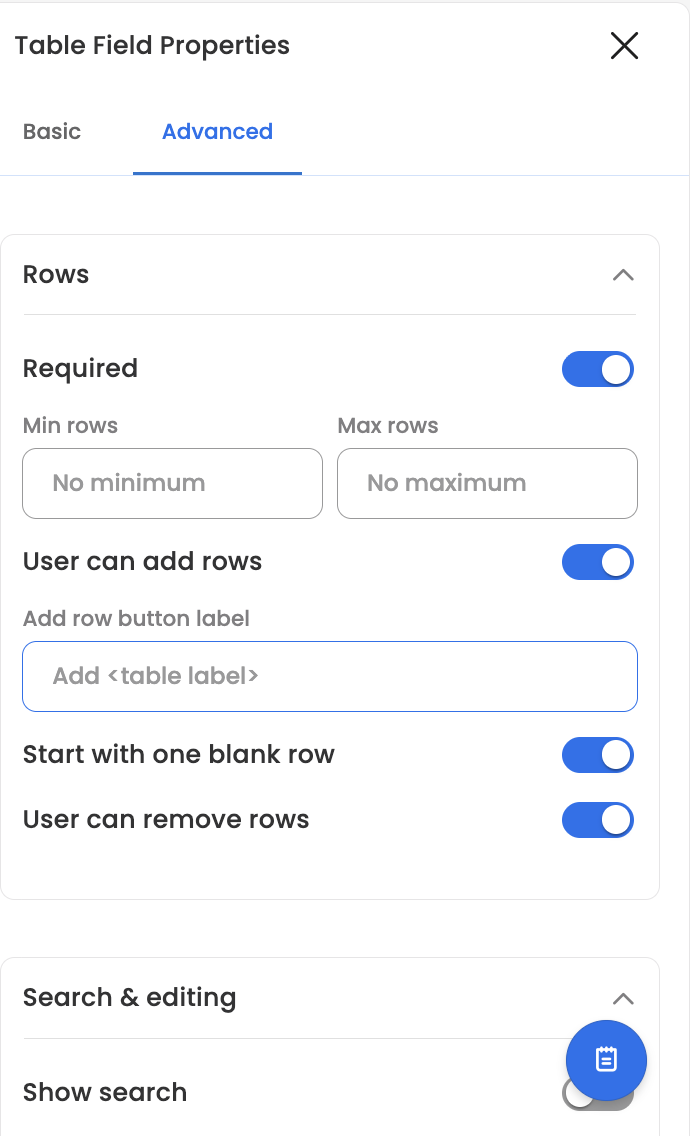
- Required: the end-user must add at least one row.
- Min rows / Max rows: row-count validation ("Add at least N rows" / "Add at most N rows"); the add button is disabled once the maximum is reached.
- User can add rows: shows the add button below the table; the Add row button label is configurable & defaults to "Add" followed by the table's label.
- Start with one blank row: the table opens with one empty row & the last remaining row can't be removed.
- User can remove rows: shows Remove in each row's menu.
Search & editing
- Show search: adds the search box above the table, with a configurable Search placeholder.
- Edit cell on: Single click (default) or Double click.
- Table height (px): the height of the table's scroll area — 420 by default.
- Hide label: hides the label above the table; helptext & sub text still show.
Visibility
The table supports the same visibility & editability conditions as any other field — it renders only when the configured visibility parameters are met.
Row rules
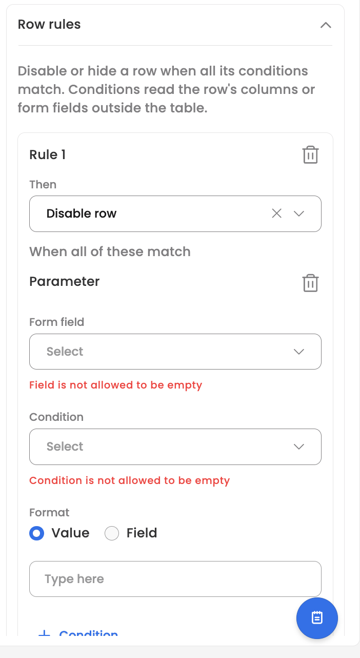
Row rules disable or hide individual rows while a rule's conditions match:
- Each rule is a Then (Disable row or Hide row) plus one or more conditions. A condition can read the row's own columns or a form field outside the table. All conditions in a rule must match for it to apply, any matching rule applies & Hide wins over Disable.
- A disabled row is locked for editing. A hidden row is not shown, but its values are still submitted & its validation is skipped.
- Rules are evaluated against the row as it was loaded or added, so an end-user's own edits never lock or hide the row they are editing. Fields outside the table are always read live.
- An incomplete rule (missing field, condition or value) is flagged in the builder & not applied.
Permissions
The Permissions section applies to the Table field exactly as it does to other fields — each workflow step can set the table & its columns Editable, Read only or Hidden.
Updated about 7 hours ago